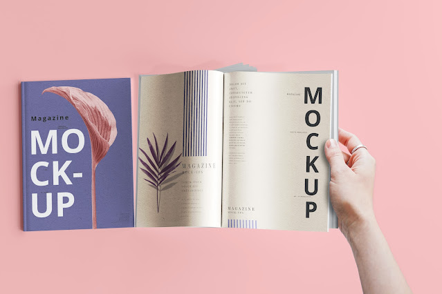
Printing booklets for your company has a long list of benefits, including but not limited to increasing brand awareness, brand recall and showcasing your high-quality products and services to your target audience. Designing a booklet may sound like a challenging task if you haven’t done it before. However, you will be pleased to find out that the a5 booklet printing process is surprisingly straightforward.
We’ve created a do’s and don’ts guide to help you create an effective and highly engaging booklet to promote your business.
Do: Choose Suitable Paper
Your booklet is only as good as the paper it is printed on. That is why it is vital that you choose durable paper that lasts. If you’re struggling to decide between paper types, it is recommended that you choose either silk or gloss paper. Silk paper provides excellent ink-to-paper contrast, which will give your booklet a luxurious feel. Silk paper is the best option if your booklet contains equal amounts of imagery and text. Gloss, on the other hand, is great if your booklet is made up of predominantly graphics and images, as it makes photos stand out on the page.
Do: Include a Bleed Area, Quiet Area and Trim Lines
Once you’ve created your booklet, you need to prepare it for printing. On your booklet design, you must include a clear trim line, quiet area and bleed area. If you do not provide a clear trim line, bleed area and quiet area, your design may be ruined during the printing process—that is the last thing you want! The trim line shows the printer exactly where to cut the paper, the 3mm bleed area ensures design elements are not accidentally removed, and the 5mm quiet area ensures your design does not look overcrowded.
Do: Use Appropriate Colours
You might think that choosing bright colours for your booklet is the best way to go because it will capture people’s attention. While you’re right that bright colours are eye-catching, you need to be careful that you don’t overdo it, as garish and gaudy colours may make your booklet look cheap. Additionally, make sure to avoid using colours that clash. If you’re struggling to find colours that match, use Canva’s colour wheel to find colours that work well together.
Don’t: Forget To Proofread and Spellcheck Your Booklet
One of the biggest mistakes people make when they create a booklet for their business is forgetting to proofread the text. To ensure that spelling and grammar are perfect in your booklet, why not run the text through a spelling and grammar application, such as Grammarly? Alternatively, programmes such as Google Docs and Microsoft Word have in-built spellcheckers that will flag any misspellings. You also need to ensure that the text in your booklet flows well. Once you’ve proofread the booklet text yourself, ask a colleague or friend to have a read, too. They may be able to give you constructive feedback that will improve the overall quality of the writing.
Don’t: Use The Wrong Sized Text
Designing an effective booklet takes a considerable amount of time and effort. Consequently, the last thing you want to do is ruin the appearance of your booklet by making the text too big or too small! Of course, your target audience needs to be able to read the text, but you need to make sure that you’re not making the text too big, as this may waste precious space that could have been used to sell your products and services. If you’re unsure if the text in your booklet is too big or too small, ask several colleagues what they think.
Don’t: Use Poor Quality Imagery
Using images in your booklet is a great way to keep readers engaged. First, however, you must ensure that the images you use are of the highest possible quality. Blurry or pixelated photos will make your booklet, and by extension, your brand, appear cheap and unreliable. Furthermore, to ensure that the images look their best in the booklet, consider printing your booklet on either silk or gloss paper. Both will make images look sharp and vibrant, which, in turn, will reflect well on your brand.
Final Thoughts
Creating an engaging booklet doesn’t happen overnight. You need to invest plenty of time and energy into creating a booklet that captures the attention of your target audience and convinces them that your products or services are worth purchasing. To do that, you must create a well-designed booklet that clearly and accurately communicates why your brand is better than your competitors. In many industries, there is stiff competition, and differentiating your brand from others is a real challenge. That is where an informative booklet sets you apart from the competition, as long as it looks the part! By following the advice above, you’re bound to create a business-winning booklet that captivates your target audience.


No comments
We love hearing from you! Thanks for leaving us some comment love! If you're a new follower, please leave your link, so we can follow you back!